Node user interface elements
n8n provides a set of predefined UI components (based on a JSON file) that allows users to input all sorts of data types. The following UI elements are available in n8n.
String
Basic configuration:
 1
 2
 3
 4
 5
 6
 7
 8
 9
10
11
12
13
14
15
16
17
18 | {
displayName: Name, // The value the user sees in the UI
name: name, // The name used to reference the element UI within the code
type: string,
required: true, // Whether the field is required or not
default: 'n8n',
description: 'The name of the user',
displayOptions: { // the resources and operations to display this element with
show: {
resource: [
// comma-separated list of resource names
],
operation: [
// comma-separated list of operation names
]
}
},
}
|

String field for inputting passwords:
 1
 2
 3
 4
 5
 6
 7
 8
 9
10
11
12
13
14
15
16
17
18
19
20
21 | {
displayName: 'Password',
name: 'password',
type: 'string',
required: true,
typeOptions: {
password: true,
},
default: '',
description: `User's password`,
displayOptions: { // the resources and operations to display this element with
show: {
resource: [
// comma-separated list of resource names
],
operation: [
// comma-separated list of operation names
]
}
},
}
|

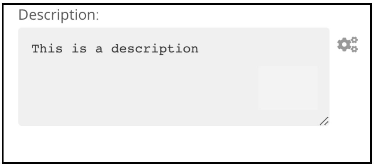
String field with more than one row:
 1
 2
 3
 4
 5
 6
 7
 8
 9
10
11
12
13
14
15
16
17
18
19
20
21 | {
displayName: 'Description',
name: 'description',
type: 'string',
required: true,
typeOptions: {
rows: 4,
},
default: '',
description: 'Description',
displayOptions: { // the resources and operations to display this element with
show: {
resource: [
// comma-separated list of resource names
],
operation: [
// comma-separated list of operation names
]
}
},
}
|
Support drag and drop for data keys
Users can drag and drop data values to map them to fields. Dragging and dropping creates an expression to load the data value. n8n supports this automatically.
You need to add an extra configuration option to support dragging and dropping data keys:
requiresDataPath: 'single': for fields that require a single string.requiresDataPath: 'multiple': for fields that can accept a comma-separated list of string.
The Compare Datasets node code has examples.
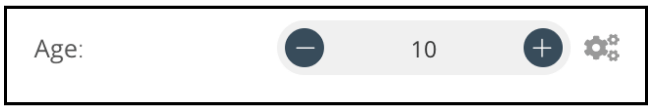
Number
Basic configuration:
 1
 2
 3
 4
 5
 6
 7
 8
 9
10
11
12
13
14
15
16
17
18
19
20
21
22
23 | {
displayName: 'Age',
name: 'age',
type: 'number',
required: true,
typeOptions: {
maxValue: 10,
minValue: 0,
numberStepSize: 1,
},
default: 10,
description: 'Your current age',
displayOptions: { // the resources and operations to display this element with
show: {
resource: [
// comma-separated list of resource names
],
operation: [
// comma-separated list of operation names
]
}
},
}
|
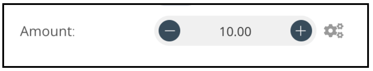
Number field with decimal points:
 1
 2
 3
 4
 5
 6
 7
 8
 9
10
11
12
13
14
15
16
17
18
19
20
21 | {
displayName: 'Amount',
name: 'amount',
type: 'number',
required: true,
typeOptions: {
numberPrecision: 2,
},
default: 10.00,
description: 'Your current amount',
displayOptions: { // the resources and operations to display this element with
show: {
resource: [
// comma-separated list of resource names
],
operation: [
// comma-separated list of operation names
]
}
},
}
|
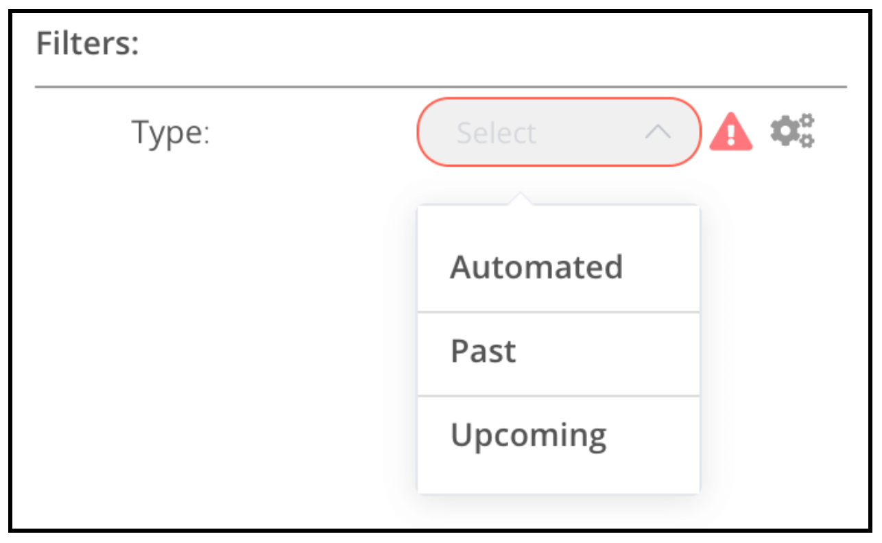
Collection
Use the collection type when you need to display optional fields.
 1
 2
 3
 4
 5
 6
 7
 8
 9
10
11
12
13
14
15
16
17
18
19
20
21
22
23
24
25
26
27
28
29
30
31
32
33
34
35
36
37
38
39 | {
displayName: 'Filters',
name: 'filters',
type: 'collection',
placeholder: 'Add Field',
default: {},
options: [
{
displayName: 'Type',
name: 'type',
type: 'options',
options: [
{
name: 'Automated',
value: 'automated',
},
{
name: 'Past',
value: 'past',
},
{
name: 'Upcoming',
value: 'upcoming',
},
],
default: '',
},
],
displayOptions: { // the resources and operations to display this element with
show: {
resource: [
// comma-separated list of resource names
],
operation: [
// comma-separated list of operation names
]
}
},
}
|
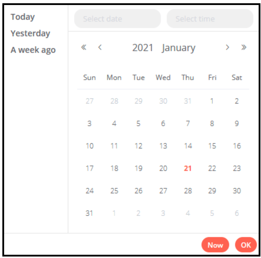
DateTime
The dateTime type provides a date picker.
 1
 2
 3
 4
 5
 6
 7
 8
 9
10
11
12
13
14
15
16
17 | {
displayName: 'Modified Since',
name: 'modified_since',
type: 'dateTime',
default: '',
description: 'The date and time when the file was last modified',
displayOptions: { // the resources and operations to display this element with
show: {
resource: [
// comma-separated list of resource names
],
operation: [
// comma-separated list of operation names
]
}
},
}
|
Boolean
The boolean type adds a toggle for entering true or false.
 1
 2
 3
 4
 5
 6
 7
 8
 9
10
11
12
13
14
15
16
17 | {
displayName: 'Wait for Image',
name: 'waitForImage',
type: 'boolean',
default: true, // Initial state of the toggle
description: 'Whether to wait for the image or not',
displayOptions: { // the resources and operations to display this element with
show: {
resource: [
// comma-separated list of resource names
],
operation: [
// comma-separated list of operation names
]
}
},
}
|

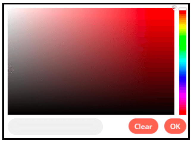
Color
The color type provides a color selector.
 1
 2
 3
 4
 5
 6
 7
 8
 9
10
11
12
13
14
15
16 | {
displayName: 'Background Color',
name: 'backgroundColor',
type: 'color',
default: '', // Initially selected color
displayOptions: { // the resources and operations to display this element with
show: {
resource: [
// comma-separated list of resource names
],
operation: [
// comma-separated list of operation names
]
}
},
}
|
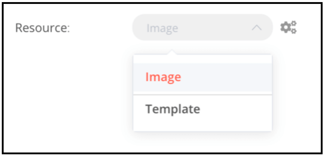
Options
The options type adds an options list. Users can select a single value.
 1
 2
 3
 4
 5
 6
 7
 8
 9
10
11
12
13
14
15
16
17
18
19
20
21
22
23
24
25
26
27 | {
displayName: 'Resource',
name: 'resource',
type: 'options',
options: [
{
name: 'Image',
value: 'image',
},
{
name: 'Template',
value: 'template',
},
],
default: 'image', // The initially selected option
description: 'Resource to consume',
displayOptions: { // the resources and operations to display this element with
show: {
resource: [
// comma-separated list of resource names
],
operation: [
// comma-separated list of operation names
]
}
},
}
|
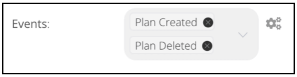
Multi options
The multiOptions type adds an options list. Users can select more than one value.
 1
 2
 3
 4
 5
 6
 7
 8
 9
10
11
12
13
14
15
16
17
18
19
20
21
22
23
24
25
26
27 | {
displayName: 'Events',
name: 'events',
type: 'multiOptions',
options: [
{
name: 'Plan Created',
value: 'planCreated',
},
{
name: 'Plan Deleted',
value: 'planDeleted',
},
],
default: [], // Initially selected options
description: 'The events to be monitored',
displayOptions: { // the resources and operations to display this element with
show: {
resource: [
// comma-separated list of resource names
],
operation: [
// comma-separated list of operation names
]
}
},
}
|
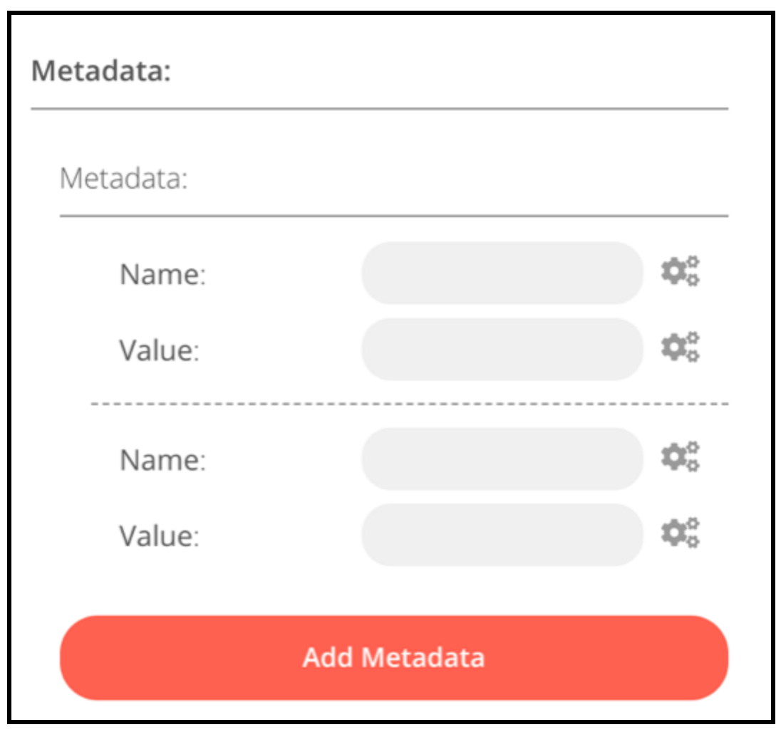
Fixed collection
Use the fixedCollection type to group fields that are semantically related.
 1
 2
 3
 4
 5
 6
 7
 8
 9
10
11
12
13
14
15
16
17
18
19
20
21
22
23
24
25
26
27
28
29
30
31
32
33
34
35
36
37
38
39
40
41
42 | {
displayName: 'Metadata',
name: 'metadataUi',
placeholder: 'Add Metadata',
type: 'fixedCollection',
default: '',
typeOptions: {
multipleValues: true,
},
description: '',
options: [
{
name: 'metadataValues',
displayName: 'Metadata',
values: [
{
displayName: 'Name',
name: 'name',
type: 'string',
default: 'Name of the metadata key to add.',
},
{
displayName: 'Value',
name: 'value',
type: 'string',
default: '',
description: 'Value to set for the metadata key.',
},
],
},
],
displayOptions: { // the resources and operations to display this element with
show: {
resource: [
// comma-separated list of resource names
],
operation: [
// comma-separated list of operation names
]
}
},
}
|
JSON
 1
 2
 3
 4
 5
 6
 7
 8
 9
10
11
12
13
14
15
16
17 | {
displayName: 'Content (JSON)',
name: 'content',
type: 'json',
default: '',
description: '',
displayOptions: { // the resources and operations to display this element with
show: {
resource: [
// comma-separated list of resource names
],
operation: [
// comma-separated list of operation names
]
}
},
}
|

Notice
Display a yellow box with a hint or extra info. Refer to Node UI design for guidance on writing good hints and info text.
| {
displayName: 'Your text here',
name: 'notice',
type: 'notice',
default: '',
},
|
Resource locator
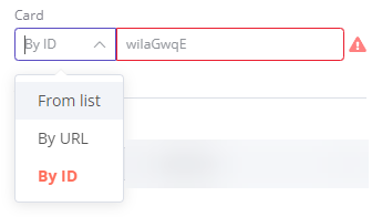
The resource locator element helps users find a specific resource in an external service, such as a card or label in Trello.
The following options are available:
- ID
- URL
- List: allows users to select or search from a prepopulated list. This option requires more coding, as you must populate the list, and handle searching if you choose to support it.
You can choose which types to include.
Example:
1
2
3
4
5
6
7
8
9
10
11
12
13
14
15
16
17
18
19
20
21
22
23
24
25
26
27
28
29
30
31
32
33
34
35
36
37
38
39
40
41
42
43
44
45
46
47
48
49
50
51
52
53
54
55
56
57
58
59
60
61
62
63
64
65
66
67
68
69
70
71 | {
displayName: 'Card',
name: 'cardID',
type: 'resourceLocator',
default: '',
description: 'Get a card'
modes: [
{
displayName: 'ID',
name: 'id',
type: 'string',
hint: 'Enter an ID',
validation: [
{
type: 'regex',
properties: {
regex: '^[0-9]'
errorMessage: 'The ID must start with a number'
},
},
],
placeholder: '12example',
// How to use the ID in API call
url: '=http://api-base-url.com/?id={{$value}}'
},
displayName: 'URL',
name: 'url',
type: 'string',
hint: 'Enter a URL',
validation: [
{
type: 'regex',
properties: {
regex: '^http'
errorMessage: 'Invalid URL'
},
},
],
placeholder: 'https://example.com/card/12example/',
// How to get the ID from the URL
extractValue: {
type: 'regex',
regex: 'example\.com\/card\/([0-9]*.*)\/'
},
displayName: 'List',
name: 'list',
type: 'list',
typeOptions: {
// You must always provide a search method
// Write this method within the methods object in your base file
// The method must populate the list, and handle searching if searchable: true
searchListMethod: 'searchMethod'
// If you want users to be able to search the list
searchable: true,
// Set to true if you want to force users to search
// When true, users can't browse the list
// Or false if users can browse a list
searchFilterRequired: true
}
],
displayOptions: { // the resources and operations to display this element with
show: {
resource: [
// comma-separated list of resource names
],
operation: [
// comma-separated list of operation names
]
}
},
}
|
Refer to the following for live examples:
HTML
The HTML editor allows users to create HTML templates in their workflows. The editor supports standard HTML, CSS in <style> tags, and expressions wrapped in {{}}. Users can add <script> tags to pull in additional JavaScript. n8n doesn't run this JavaScript during workflow execution.
| {
displayName: 'HTML Template', // The value the user sees in the UI
name: 'html', // The name used to reference the element UI within the code
type: 'string',
typeOptions: {
editor: 'htmlEditor',
},
default: placeholder, // Loads n8n's placeholder HTML template
noDataExpression: true, // Prevent using an expression for the field
description: 'HTML template to render',
},
|
Refer to Html.node.ts for a live example.